Cumulative Layout Shift (CLS): How to Measure & Optimize CLS
Cumulative Layout Shift (CLS) is a metric that quantifies the instability of page elements — something the SEO community has overlooked for years. It's one of the three Core Web Vitals metrics that Google uses to evaluate a website's real-world performance, which also includes Largest Contentful Paint (LCP) and First Input Delay (FID).
To paint a clearer picture of how layout shifts can disrupt the user experience, take a look at Forbes' website after loading it for the first time.
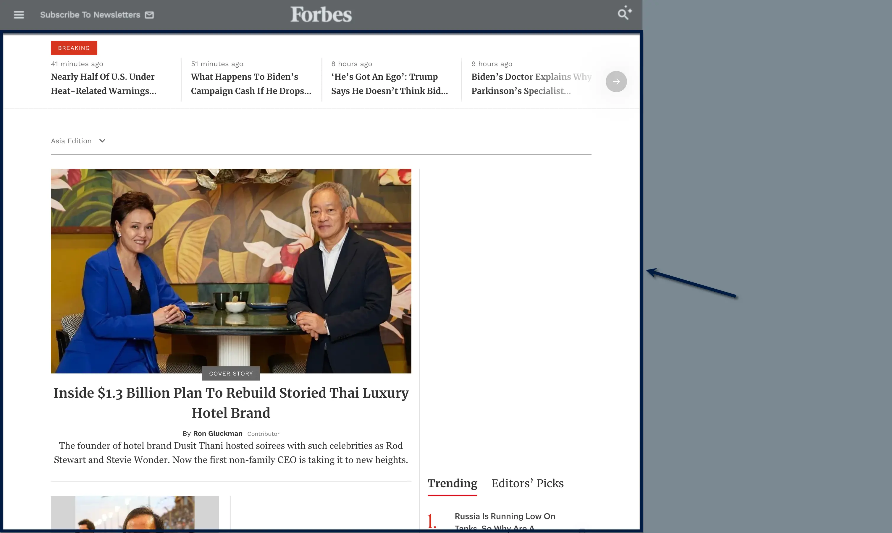
After a few seconds, the top ad panel pops into the viewport — displacing all the content below it.
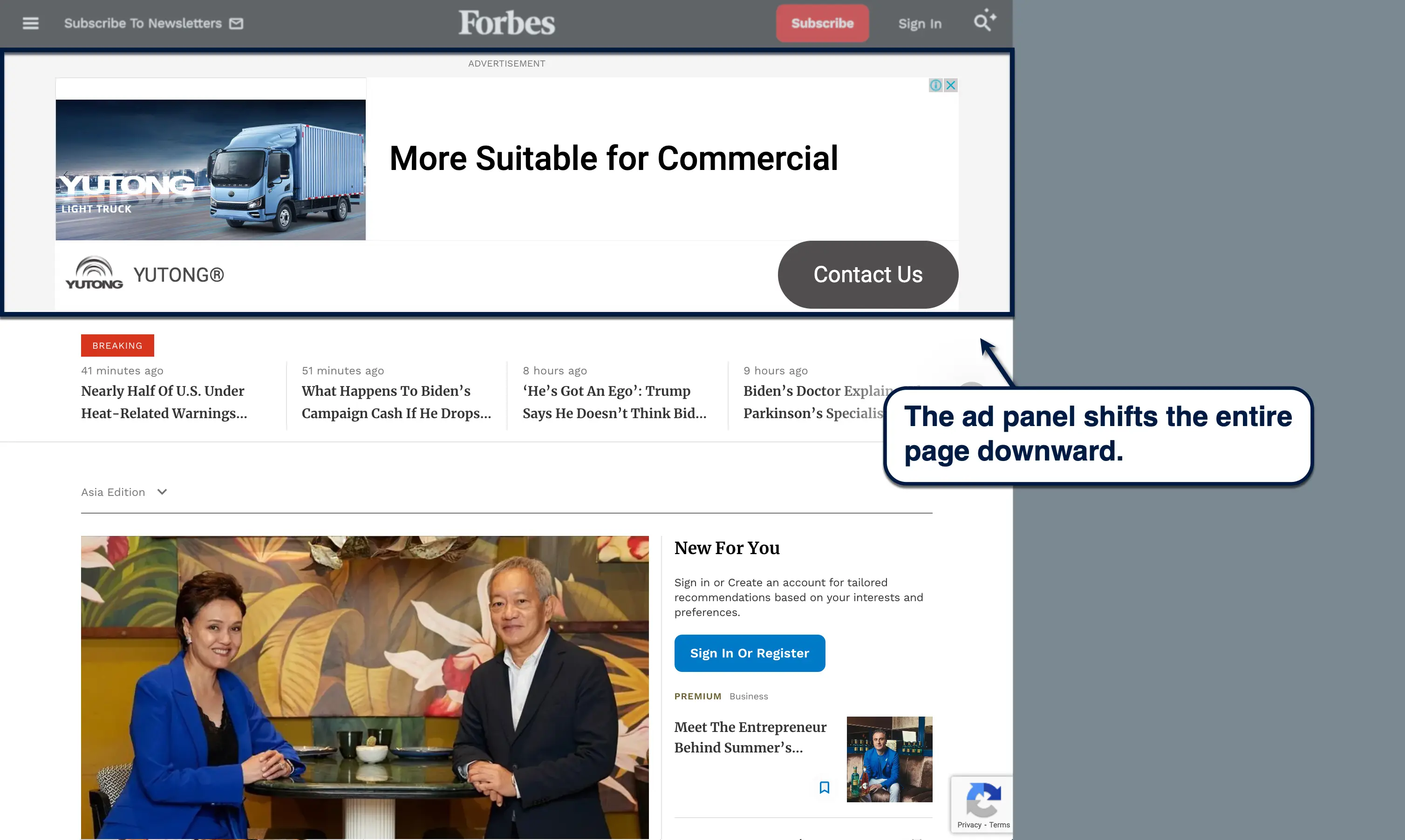
Looks bad, right?
The problem is, plenty of unoptimized pages have multiple layout shifts in one session. And CLS aims to measure the maximum impact of those shifts on the user experience.
Layout shifts negatively affect the user experience in a handful of ways.
Not only is it jarring to look at, it's also bad for readability and disrupts the user's focus — something you can't afford to lose if you want your audience to stay engaged. In worse cases, unexpected layout shifts may cause misclicks on ads, CTA buttons, or any other link that the user wouldn't have clicked otherwise.
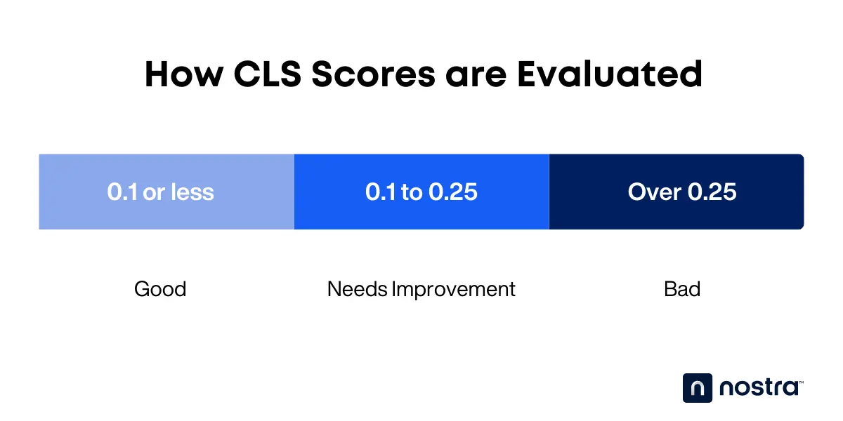
Here's how CLS scores are evaluated:
- 0.1 or less - Good
- 0.1 to 0.25 - Needs improvement
- Over 0.25 - Bad
Understanding How CLS is Calculated
Now that you know what CLS scores mean, it's time to take a closer look at how they are actually calculated.
Layout Shifts, Impact Fraction, and Distance Fraction
Layout shifts are reported as "layout-shift" entries whenever page elements move unexpectedly. These add to layout shift scores, which are calculated using two metrics: impact fraction and distance fraction.
First up, the impact fraction tracks the overall viewport area affected by the layout shift.
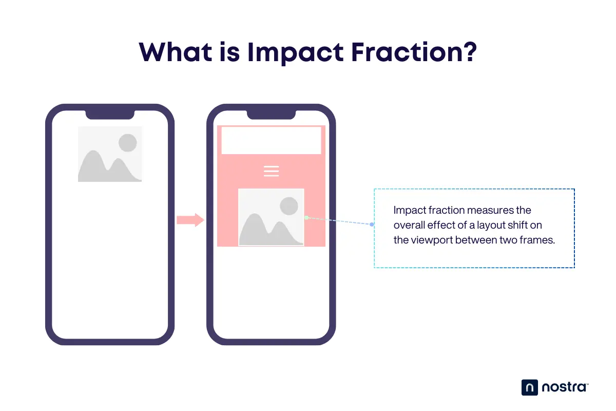
Let's say you have an image that takes up 30% of the top space in the viewport.
In the next frame, a header and menu button appear and shift the image down by 30% of the viewport height. Adding the original space occupied by the image to the space it shifted gets you 60%, which means the impact fraction is 0.6.
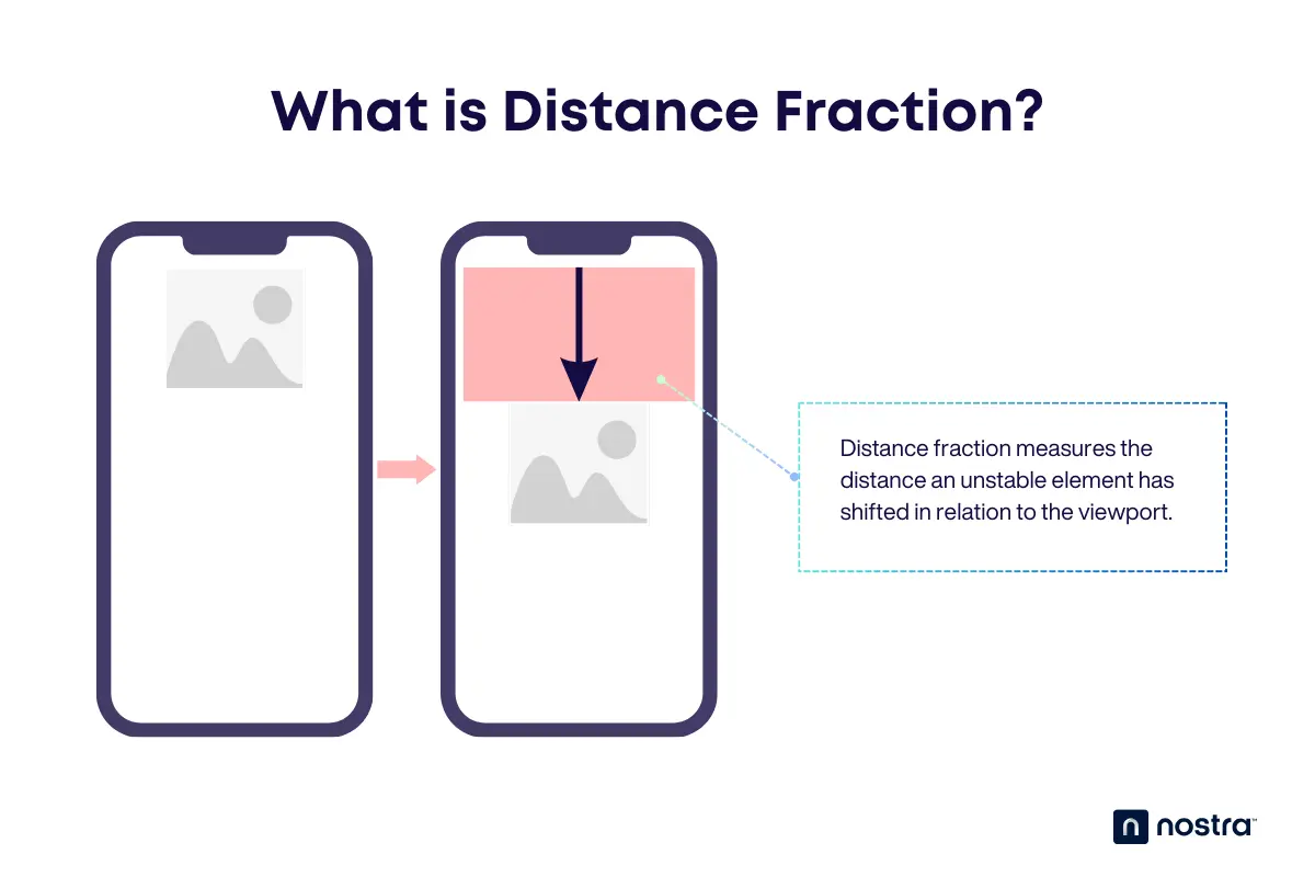
The next part of the equation is the distance fraction, which only measures the distance an unstable element moved.
In relation to the example above, the image shifted down by 30% of the viewport height. That means the distance fraction is 0.3.
Session Window and Scoring
Both the impact and distance fractions are measured within "session windows," which are bursts of layout shifts within a single second. Additional session windows may be recorded whenever layout shifts occur for up to a maximum of five seconds.
Each of these session windows is scored using the following formula:

For example, if a session window has an impact fraction is 0.6 and distance fraction is 0.3, then the layout shift score for that particular session is 0.18.

When calculating your overall CLS score, only the session window with the highest layout shift score is used.
Tools for Measuring CLS
Knowing the variables that go into layout shift scores will help you understand exactly what CLS aims to quantify.
However, calculating for a page's CLS is far from practical without the use of automated tracking tools.
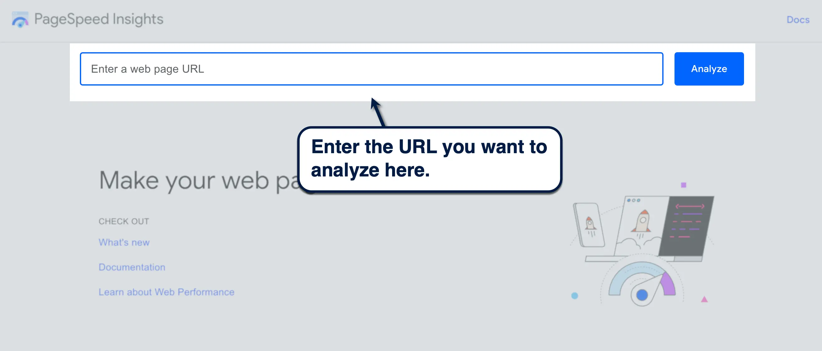
PageSpeed Insights, for example, automatically reports your CLS score along with other Core Web Vitals metrics. To use it, just enter your website or page URL and click 'Analyze.'
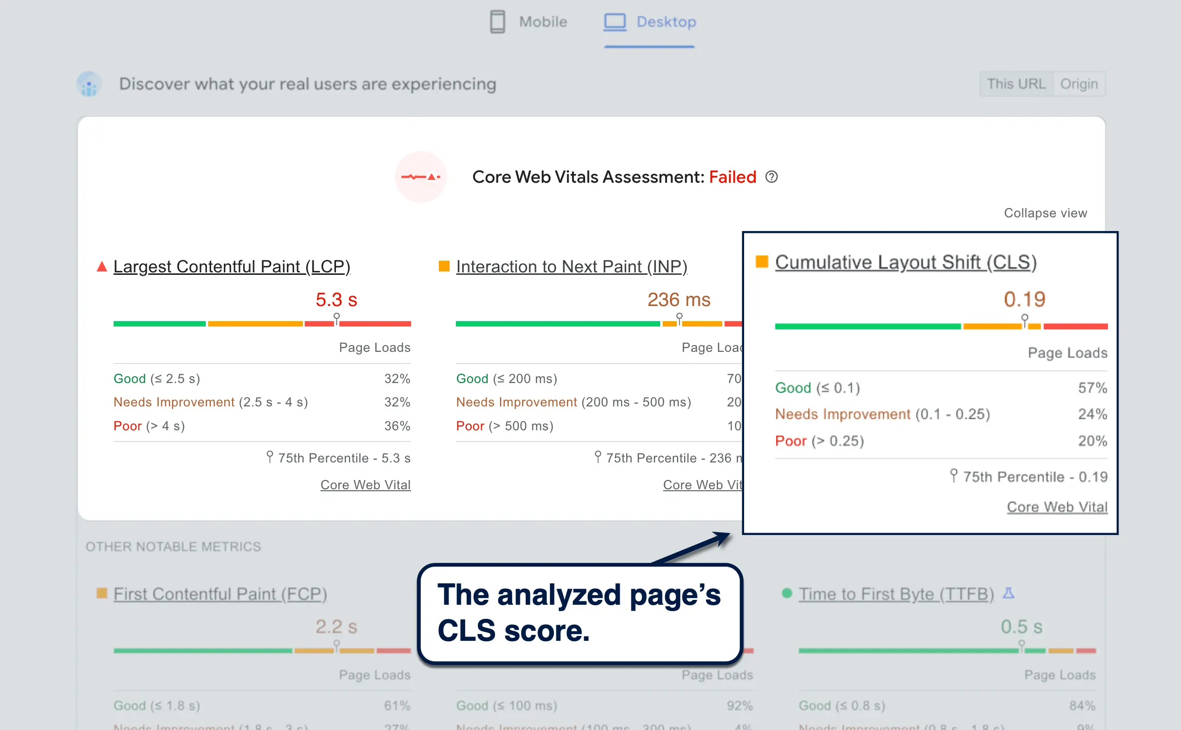
Within seconds, PageSpeed Insights will generate a report with your Core Web Vitals metrics right at the top — including your CLS score.
Other than PageSpeed Insights, here are some of the other tools you can use to measure your CLS score:
- Lighthouse — Works through Chrome DevTools for conveniently analyzing any page's Core Web Vitals across a variety of devices.
- CrUX Dashboard — Instantly turn your Core Web Vitals report into an interactive dashboard on Looker Studio.
- WebPageTest — Test your CLS on multiple device configurations and user segments (location, connection type, etc.).
Common Causes of CLS
If you have a high CLS score, your website may be affected by one or more of the following issues:
Images Without Dimensions
Unexpected layout shifts may occur if your website doesn't have appropriately sized spaces allocated for images.
Without set image dimensions specified in your page's layout, browsers might render other content on a space where an image is supposed to be, like text blocks, forms, or menus. As a result, these elements will get shifted around once the image pops in — resulting in a layout shift.
Ads and Embeds
Dynamic ad containers, embedded content, and other iframes may also cause layout shifts if you don't set specific dimensions for them.
Ads can be particularly tricky since you need them to be seen in order to maximize your CPM revenue. That means pushing them to the bottom of your page isn't always the best option.
Most ad networks also use dynamic banner sizes. This warrants more wiggle room in your page layouts unless you set specific dimensions for them.
Dynamically-Injected Content
Other types of late-loading content include embeddable widgets from third-party services and social media feeds. Some examples are Google Maps, Shopify product feeds, and YouTube videos.
Injecting additional content into the DOM after the initial render will, of course, push around elements that were loaded first. This contributes to a higher CLS score and a worse user experience.
Web Fonts Causing FOIT/FOUT
Flash of Invisible Text (FOIT) and Flash of Unstyled Text (FOUT) are basically placeholders while the browser waits to download the necessary files to display fonts properly.
With FOIT, the text remains invisible but selectable while the web fonts are loading — whereas FOUT uses a system font in place of the web font. Either way, layout shifts may occur if the actual web font has bigger characters, wider spaces, or both.
Actions Waiting for a Network Response Before Updating DOM
Anything that adds to your CLS score is worsened with high latency. That includes the items listed above along with elements that are deferred or asynchronously loaded.
Animations, transition effects, buttons, and forms come to mind, especially if they're painted above or over elements that are supposed to load first.
Best Practices to Minimize CLS
Solving CLS can be challenging, but you don't need to be an expert to achieve it, either.
Always Include Size Attributes for Images and Videos
Image dimensions can be easily set through your frontend page editor or by adding "height" and "width" attributes in the image tag.

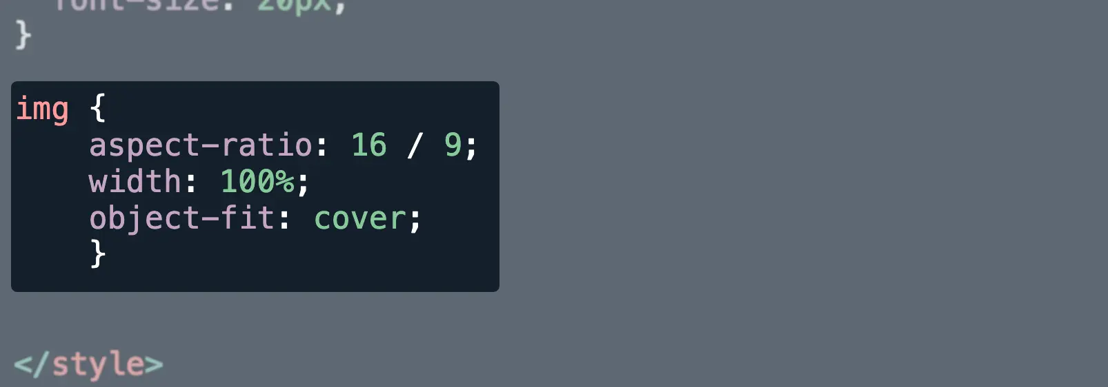
Another fix is to use the "aspect-ratio" CSS property. This not only tells browsers to reserve space for accommodating the image, but also ensures that it will be displayed properly across different devices with the "object-fit" property.
Here's what the "aspect-ratio" CSS property looks like:
Tip: You can use Google Analytics to analyze your traffic and determine the preferred screen sizes of your audience. This lets you know which device to prioritize when setting specific dimensions or aspect ratios for your images.
Reserve Space for Ads and Embeds
There are a few things you can do to reduce or eliminate layout shifts caused by dynamically-loaded ads and embeds.
The first and most obvious technique is to push those to the bottom of your page, which is what a lot of websites already do. A more permanent solution, however, is to use CSS placeholders with minimum height and width parameters.
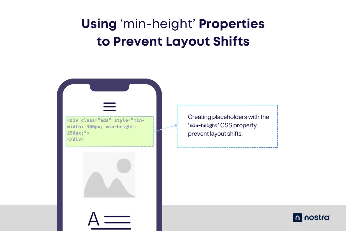
You can use the "min-height" and "min-width" CSS properties to create placeholder space. This should prevent layout shifts caused by both dynamic and responsive elements, like ads, embeds, and blocks in eCommerce platforms.

Here's another, simpler example of a placeholder that can prevent layout shifts when using dynamically-injected content:

Optimize Web Font Loading
Moving onto fonts, the name of the game is making sure they load as soon as possible.
You can easily diagnose layout shifts caused by fonts through Chrome DevTools. Just go to the 'Network' tab, click 'Font,' choose the third-party font, and switch to the 'Timing' tab.
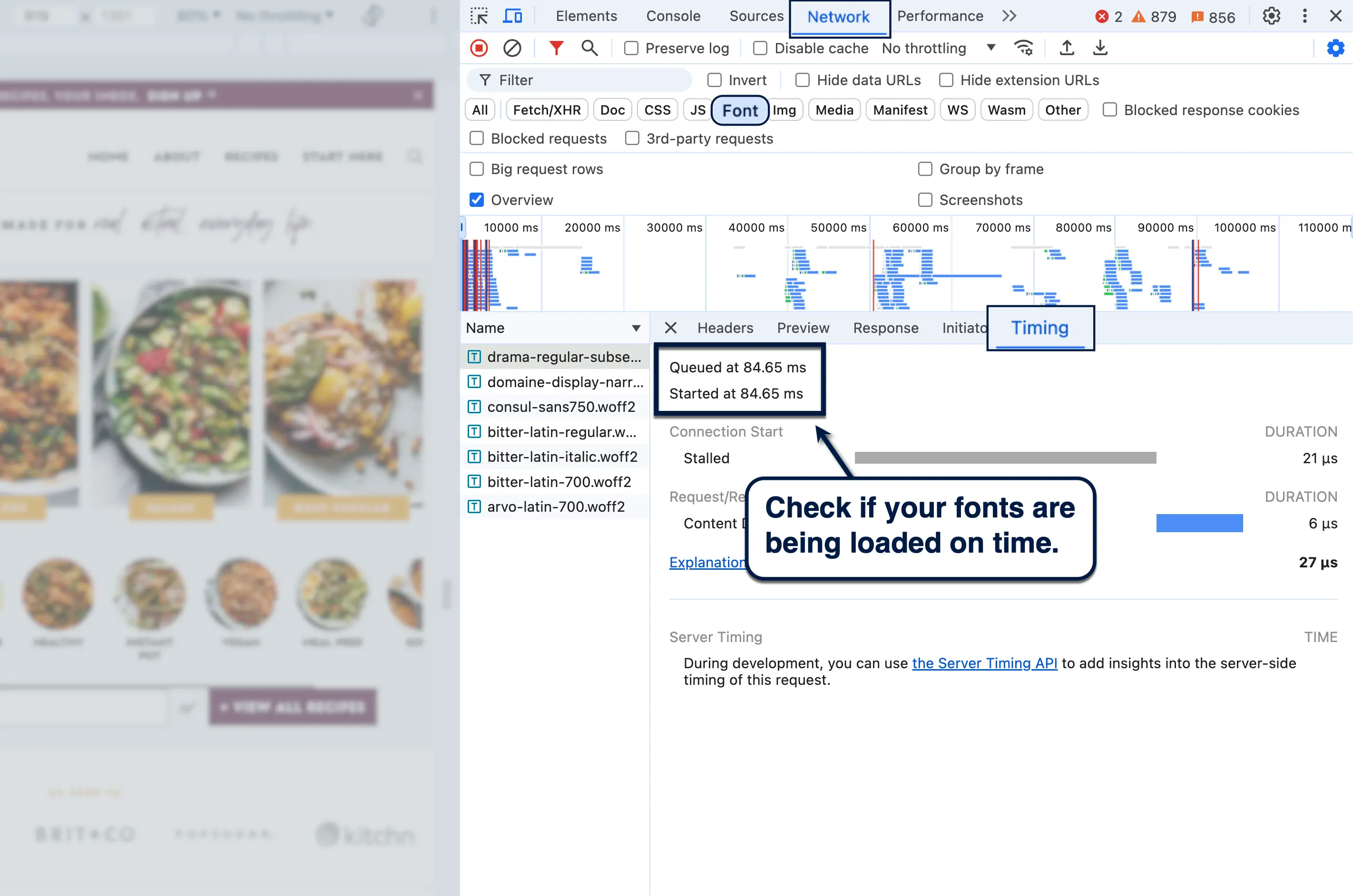
If you notice a considerable delay between your page's loading time and the font's download speed, your first option is to preload your web fonts. This tells browsers to download the essential font files immediately and avoid FOUT.
To do this, add a "link" tag directly below your website's header element.

For large font files that could potentially affect the loading of other resources, a good alternative would be to inline font declarations. That means putting them in the header section of your website's main document rather than in another stylesheet.
If you're pulling fonts from a third-party app, another option would be to use the "preconnect" resource hint. Again, this should be placed in the document's header section with the following format:

Take note that the "preconnect" resource hint is used twice for this — once for the font's origin and another for the actual connection to be used for downloading the files.
Avoid Inserting Content Above The Fold
When building new pages, a great way to prevent layout shifts is to avoid positioning late-loading content above the fold.
This can be anything, from ad blocks to newsletter opt-in forms that load asynchronously. To minimize or negate their impact on CLS, move them to the bottom of the page — loading either outside the viewport or only when users scroll to a certain point when session windows are no longer recorded.
If you're optimizing your eCommerce website, pay close attention to your page layouts when using automated tools for lazy or deferred loading. To be safe, consider putting only lightweight assets above the fold.
Be Mindful of Animations and Transitions
Animated assets and transition effects can add "flavor" to the user experience, but you need to tread carefully, especially when using animations above the fold.
JavaScript preloader animations, for instance, are known to cause noticeable layout shifts without an intricate optimization process. As such, it's recommended to go for CSS animations which are smoother, hardware-accelerated, and way less likely to cause shifts.
Performance-friendly CSS animations include scale, slide-in, opacity, transform, and rotate.
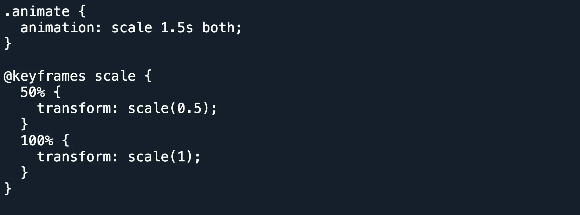
However, try to avoid using animations with certain CSS properties that trigger layout and paint events, like:
- 'box-shadow'
- 'box-sizing'
- 'text-shadow'
- 'top'
- 'bottom'
- 'left'
- 'right'
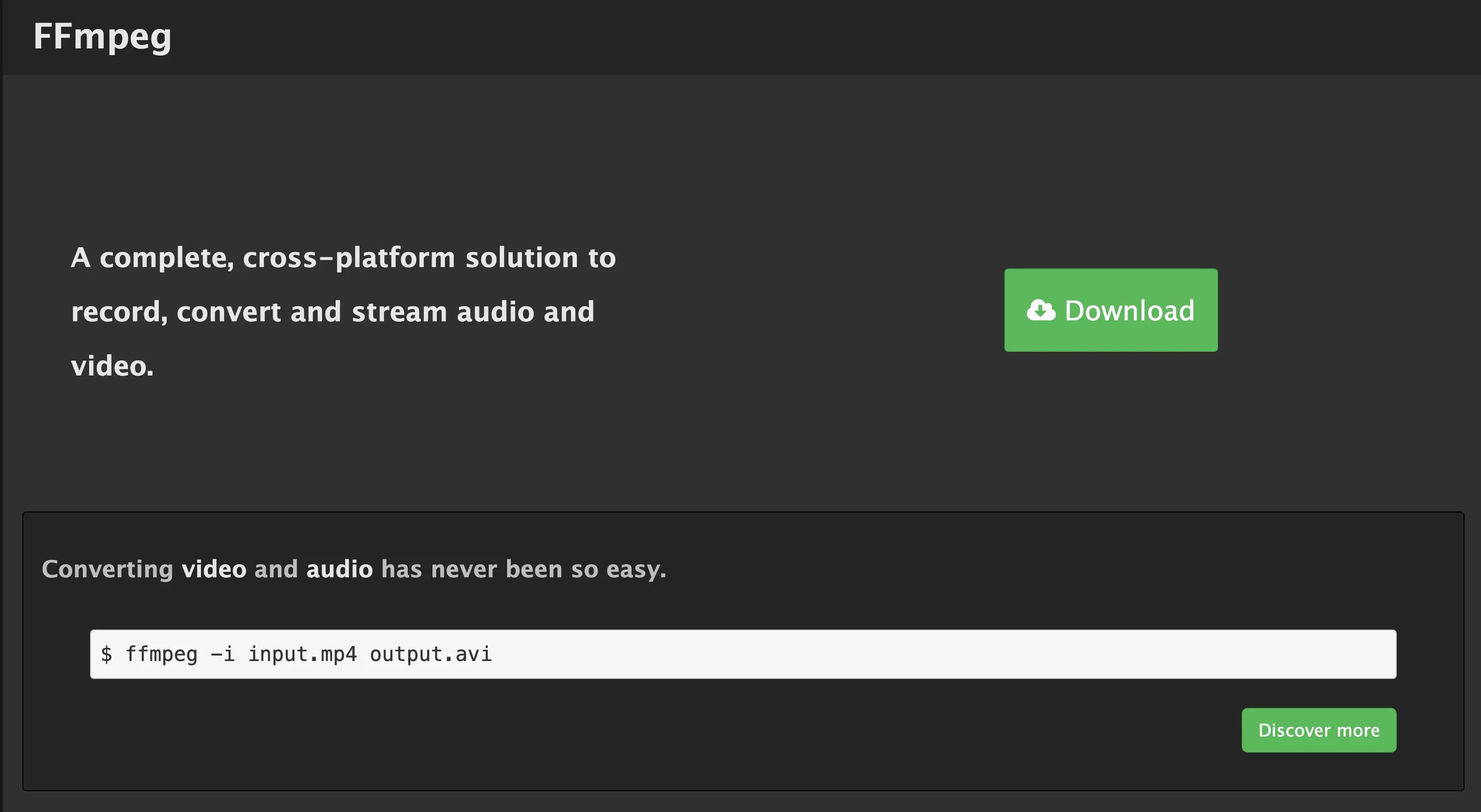
If you're thinking about animated GIFs, convert them into MPEG videos instead to improve loading speed. A simple tool like FFmpeg should get the job done nicely.
Lastly, remember that you can always wrap animations inside a division ("div") or container and set specific dimensions to prevent unexpected layout shifts. This will tell browsers to reserve a space on your page for your animations and effects.
Advanced Techniques for Tackling CLS
The tips above should be more than enough to optimize the CLS of most pages. But sometimes you need to go beyond the basics to address CLS issues on your website once and for all.
That said, here are three advanced techniques that can improve the stability and overall performance of your website:
Use the 'contain' Property
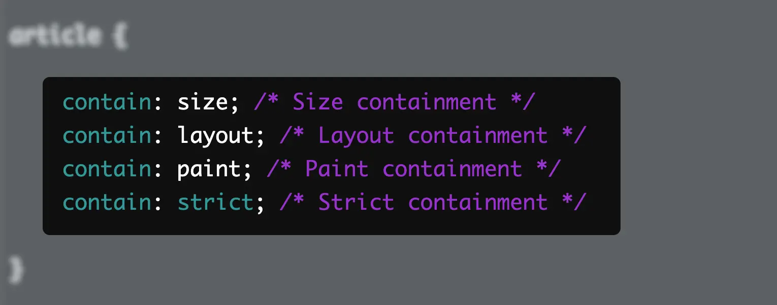
The "contain" CSS property allows you to create sections of content or elements that are completely independent of the rest of the web document. This is useful if you want to isolate dynamic content into a DOM subtree while specifying its dimensions to prevent unexpected layout shifts.
There are three main containment types you can use to isolate content and prevent layout shifts:
- Size containment — Tells the browser to ignore the elements inside the container when calculating the page layout, except for a set width and height for the container.
- Layout containment — Tells browsers that the container has its own layout, which shouldn't affect the rest of the page (and vice versa).
- Paint containment — Prevents any contained element to paint or change pixels beyond the container's boundaries.
- Strict containment — Has the same effect as using all the containment types above (in addition to "style" containment).
Optimize the Delivery of Third-Party Scripts
Problems with CLS are exacerbated with late-loading resources, including third-party scripts.
As a rule of thumb, you should aim to minify every script in your web document by removing all empty space and extra characters that don't play a functional role. This includes comments, new lines, and tabs.
Streamline the code minification process with a tool like Minifier.org.

For critical scripts, you can preload them as link elements using the following syntax:
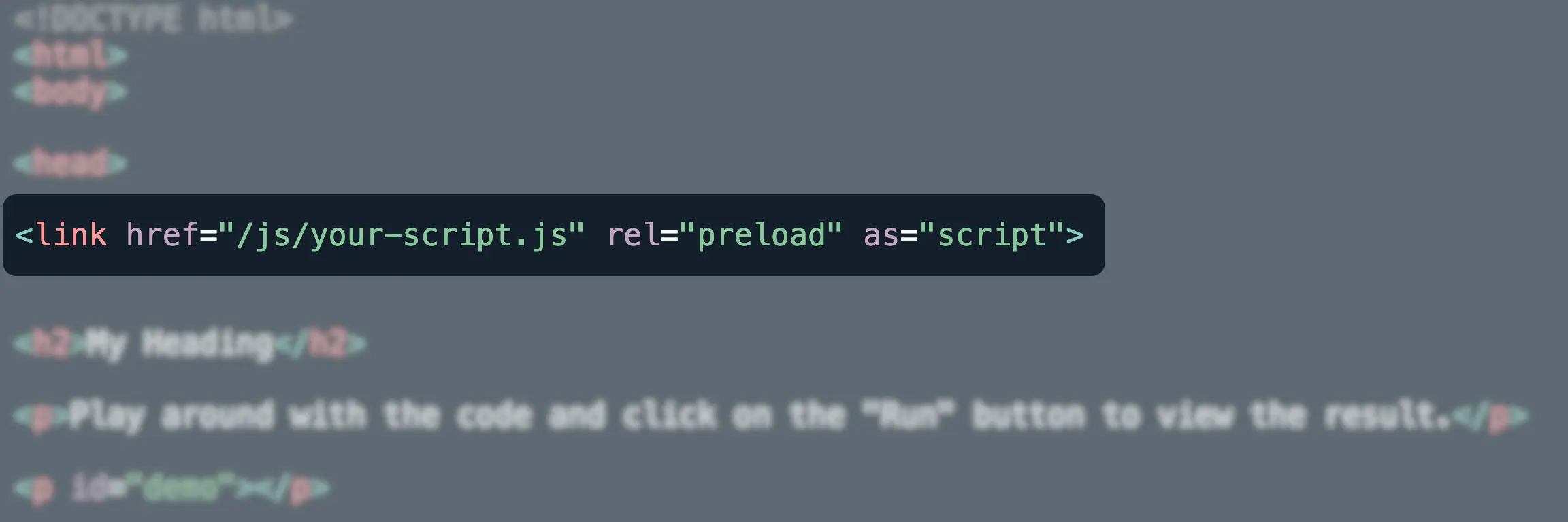
For non-critical scripts, the standard practice is to defer loading them until they're needed (depending on the order they appear in your document). You can defer scripts using the 'defer' attribute or through plugins like CSS JS Manager.
Monitor and Analyze Real User Data
Perhaps the most important step when optimizing your website's CLS score is to test your changes and analyze the results.
The good news is, changes that impact layout shifts are trackable as soon as they're implemented. There are also plenty of free tools that can help with this objective.
Lighthouse, for example, is accessible via Chrome's "inspect" mode and can scan any page's Core Web Vitals in seconds. Other than tracking your CLS score, you'll also be able to review specific issues that contribute to layout shifts.
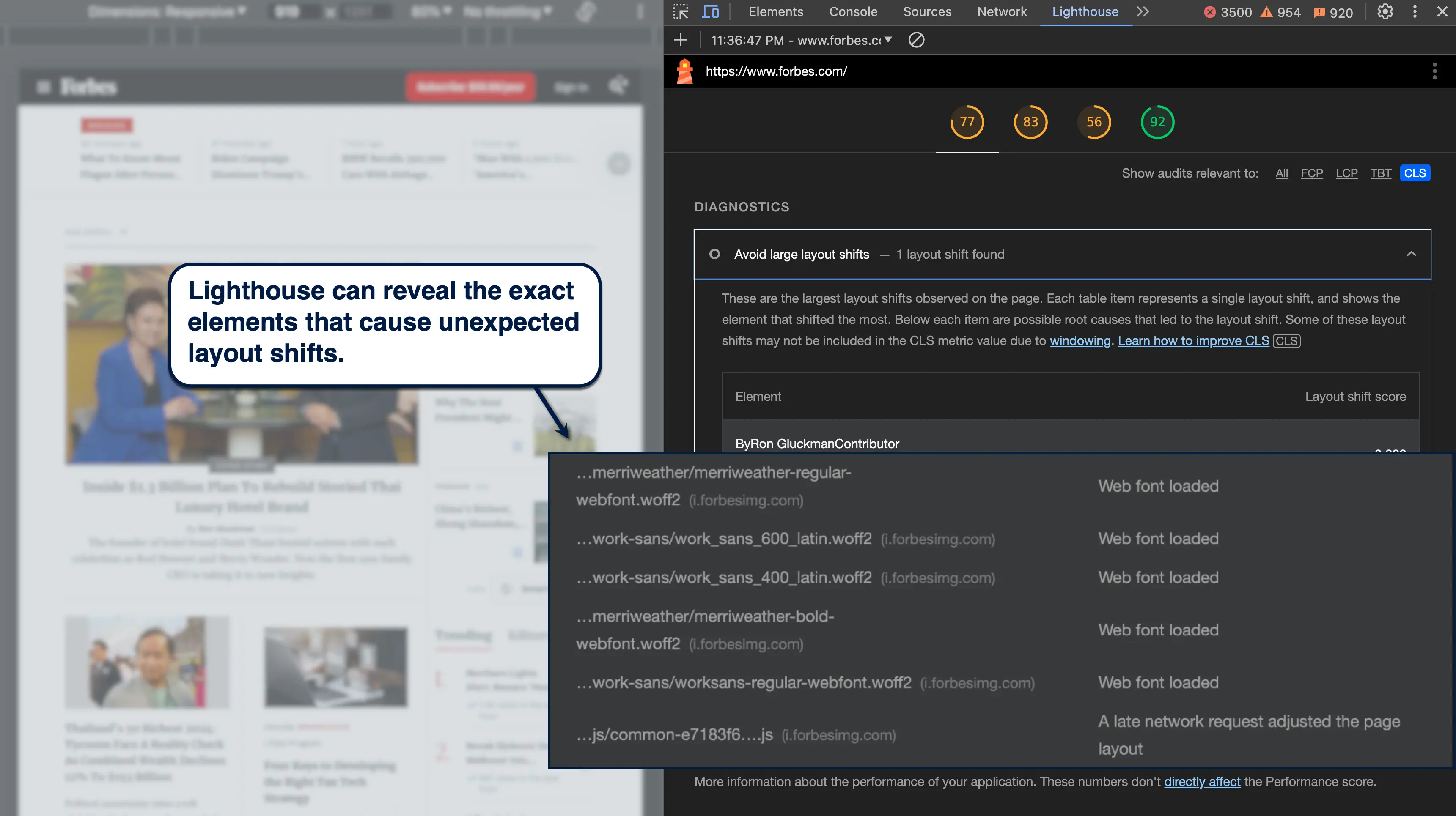
Tip: If your changes aren't reflected in Lighthouse's report, try clearing your browser's cache.
Take Optimization to the Next Level with Nostra
CLS is an important piece of the user experience puzzle that a lot of website owners tend to overlook.
That has to change.
Keep in mind that optimizing CLS is not only good for SEO — it's also crucial for websites that rely on user engagement and interactions to be profitable. Ecommerce websites, in particular, have a lot to lose if potential customers keep on mis-clicking buttons around your online store due to annoying layout shifts.
Improve CLS by unraveling their root causes, building rock-solid layouts, and ensuring each element has a dedicated space on your page.
To supercharge your CLS score along with other Core Web Vitals metrics, maximize your success with a service like Nostra's Edge Delivery Engine. This enabled Glamnetic to boost conversions by up to 120% and Nood by 24%.
Book a demo here to learn more.
.svg)

.svg)
.svg)
.svg)

.svg)


